
The Psychology of Memorable Brands: Why Brand Quirks Stick and How to Build Them Into Your Strategy
Think of three brands you genuinely remember. Not the biggest ones, not the most advertised, but the ones that actually live (happily) rent-free in your head. The ones you've recommended to a friend, or smiled at when you saw them, or thought about even when you weren't buying anything.
Now ask yourself: why those ones? What is it, specifically, that made them stick?
My guess is it's not their photos. It's probably not their tagline either, or how many Instagram posts they ran last quarter.
It's something stranger and more specific than that: a feeling, a detail, a moment that felt unexpectedly human. Maybe it was something they did that no other brand in that space would ever think to do. Maybe it was a little funny, or a little odd, or just more them than you expected.
That thing you're thinking of? That's a quirk. And it's not an accident.
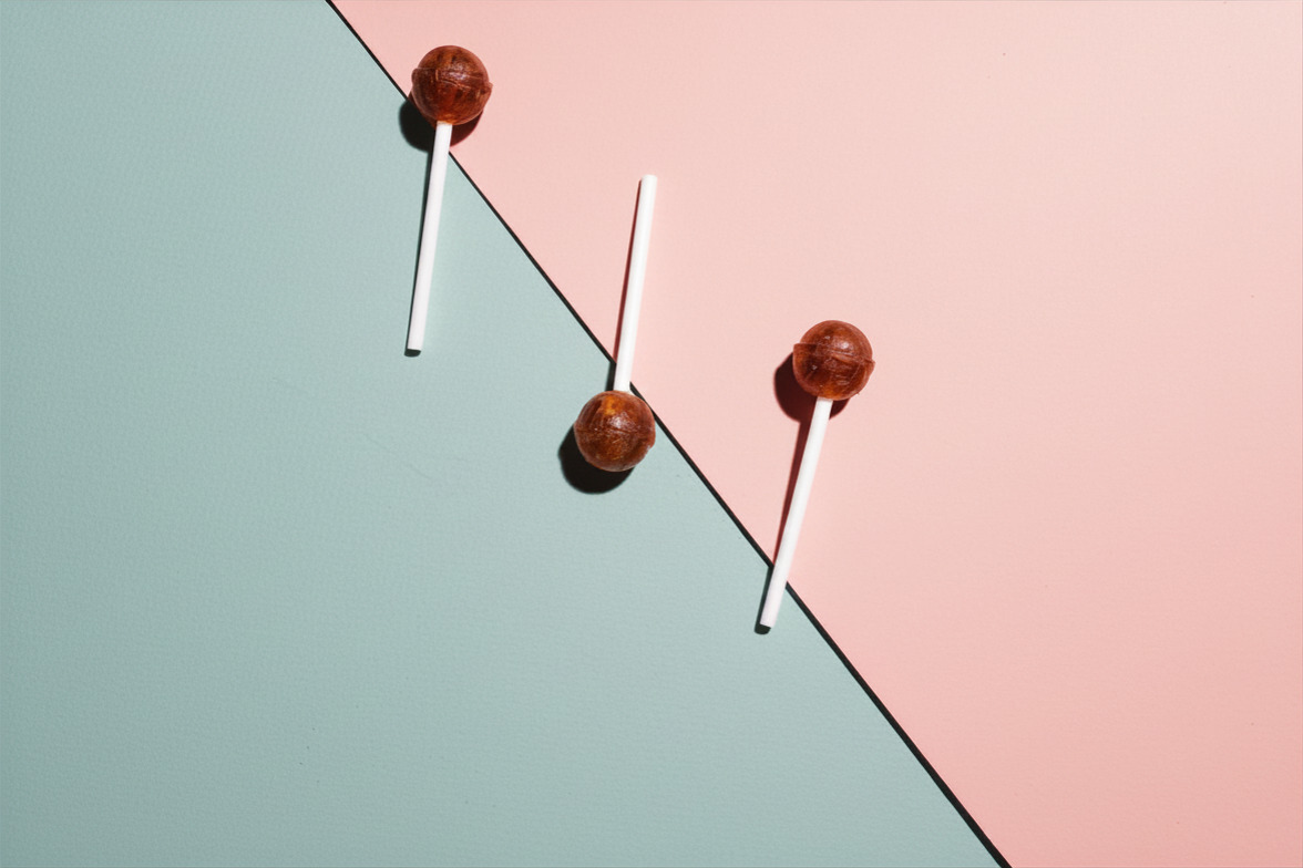
A friend recently told me how delighted they were when a photo printing company sent a lollipop along with their photo order.
Not a discount code. Not a feedback survey. No explanation. Just: here's a little something.
I think about that lollipop a lot. Because that tiny piece of candy is doing something most marketing can only dream of: it's making a brand genuinely, lastingly memorable. And it turns out there's real psychology behind why it works so well.
Your Brain Is Wired to Remember the Weird Stuff
Here's a fun thing about human memory: it's not a filing cabinet. It's more like a highlight reel. And your brain is very particular about what makes the cut.
Psychologists have identified three effects that are especially relevant to how brands get remembered, and they all point to the same conclusion: ordinary gets forgotten, but quirky gets saved.
The Von Restorff Effect (also called the "isolation effect") says that when one thing stands out from a crowd, it gets remembered. Named after psychiatrist Hedwig von Restorff, who noticed in 1933 that a single item that looks different from everything else on a list is the one people recall. In a sea of similar-looking brands all doing the same category things, a single distinctive element is the thing that rises to the top of memory.
The Mere Exposure Effect says that we tend to like things more the more we encounter them. Psychologist Robert Zajonc showed that simple familiarity breeds affection, which is why a quirk that shows up consistently across every touchpoint does double duty. It doesn't just surprise you once; it builds a warm, familiar feeling every time you come back.
Dual Coding Theory comes from psychologist Allan Paivio, who found that we remember things better when they're encoded in two ways at once (verbally and visually, or verbally and physically, or any combination of channels). A quirk that hits multiple senses at the same time (a name you say out loud and a mascot you picture, a smell and a taste, a visual identity and an attitude) creates a richer, stickier memory trace than any single-channel message could.
Put those three together, and you get a blueprint for why quirky brands punch so far above their weight.
Three Brands That Are Basically Applied Psychology

The Popcorn Machine at the Hardware Store
There's a hardware store in Southern Oregon where I used to live that I genuinely loved visiting. Not in the way I visited Home Depot - that was more of a necessary errand, the retail equivalent of a trip to the DMV. This place was different. For one, the staff was incredibly friendly and helpful (a real gift for those of us who look like a deer in the headlights in the fastening aisle). But two (and this is the thing I still think about), they always had a popcorn machine going. Free popcorn, just there, while you browsed.
Walk in and the smell of popcorn hits you before the motor oil does. Grab a bag. Wander the aisles. There's genuinely no rush.
This is Dual Coding doing its thing in real time: you're getting a visual memory of the store and a sensory one - the warmth, the smell, the taste. That layered memory is far stickier than any logo or tagline could create on its own.
But what really makes this brilliant is the strategic reframe. This little store can't compete with Home Depot on inventory or price. So it doesn't try. The popcorn signals: this is a place to belong, not just a place to shop. It redefines the category it's competing in from "hardware store" to "neighborhood institution."
And thanks to the Mere Exposure Effect, every visit deepens the attachment. Regulars don't just go back because they need a drill bit. They go back because they genuinely like being there. I know I did!
The takeaway: Your quirk can change the game you're playing. A small, consistent experience can shift you out of head-to-head commodity competition and into a category of one.
Mailchimp: Making Email Marketing Charming
Email marketing software is, honestly, not a thrilling product (to me). It is a tool that helps you send bulk emails. And yet, Mailchimp built a brand so warm, weird, and genuinely lovable that it became the default choice for a generation of small businesses and creative entrepreneurs.
How?
Von Restorff, primarily. In a category full of serious, enterprise-y, blue-and-grey sameness, Mailchimp showed up with a name that rhymes, a chimpanzee mascot named Freddie, hand-drawn illustrations, and copy that treated you like a person instead of a procurement process. It stood out so hard that it was impossible not to notice.
The Dual Coding came from Freddie, a character you could picture and describe, a name you said out loud that sounded like nothing else in the space. The verbal and visual worked together to create a brand imprint that stuck. And then the Mere Exposure Effect did the rest: every email you sent, every login, every "You're about to send to your whole list — you sure?" screen, built a little more affection.
They essentially asked: what if dry B2B software had the personality of your favorite local coffee shop? The answer turned out to be worth a few billion dollars.
The takeaway: The more commoditized your product, the more powerful a genuine personality becomes. When the product differences are invisible, the brand difference is everything.
Liquid Death: Canned Water With a Death Wish
Liquid Death sells water. Canned water. A product so generic that it is literally the definition of a commodity.
They responded to this by building one of the most distinctive brands in the entire beverage industry. The name sounds like a metal band. The cans look like tallboys at a punk show. The tagline is "Murder Your Thirst." Their marketing has featured celebrity death pacts, limited-edition art cans, and a general energy that says: we know this is completely unhinged, and we are fully committed.
This is Von Restorff at its most dramatic. Every other water brand is trying to signal purity, calm, and health. Liquid Death signals chaos, irreverence, and a light disregard for the concept of hydration branding. In a crowded cooler of similar-looking bottles, the black-and-silver skull can is the thing your eye snaps to, and once you've seen it, you do not forget it.
The Dual Coding is doing heavy lifting too: the verbal identity ("Murder Your Thirst," "Liquid Death") and the visual identity (the aggressive can, the skull) reinforce each other so completely that either one can conjure the other. Hear the name, see the can. See the can, hear the name. That's memory architecture.
The takeaway: Tone itself can be the quirk. You don't need a mascot or a ritual or a physical object, you just need to commit to a voice and a worldview more fully than your category has ever dared to.
How to Build This Into Your Brand (Without Forcing It)
Okay, so you're in on brand quirks. But here's the thing: you can't just add a quirk to a brand the way you add a side salad to an order. Forced quirks are painful to witness. The goal isn't to be weird for weirdness's sake, but rather to find the strangeness that's uniquely yours and build it up intentionally.
Here's how that works across the three layers of brand.
1. Brand Strategy: Find Your Permission Slip First
Before you touch messaging or visuals, ask: what are we genuinely allowed to be weird about?
Every brand has a zone of authentic permission. Liquid Death can be aggressive because the founder came from entertainment, not the wellness industry, and the irreverence is real, not performed. The hardware store can be warm and old-fashioned because it actually is. The lollipop works because the brand genuinely is in the joy business.
A useful exercise: Write down everything about your business that's a little unexpected, counterintuitive, or just slightly off from category norms. Then ask: which of these are consistent with why we actually exist? Those are your quirk candidates. The ones that pass that filter are the ones worth amplifying.
Your quirk should feel like an extension of your brand truth, not a costume over it.
2. Messaging: Let the Quirk Do the Talking
Once you know what your quirk is, build it into your words at every level:
Name and tagline.
Mailchimp's name is the quirk; it does the Von Restorff job before a single word of marketing runs. If you have room to bring some personality into your naming (for a product, a campaign, a feature), take it.
Micro-copy.
Confirmation emails, error messages, packaging inserts, the little blurb in your email footer. This is where brand voice becomes brand personality. It's also where most brands go completely silent and generic. Don't. This is Dual Coding territory: your visual brand is already doing something, and your words should be doing something too.
Your brand story.
Make the quirk explicit. The lollipop company could simply say: "Every order comes with a little surprise." That one line does so much work; it invites curiosity, sets expectation, and starts building delight before the box even arrives.
Consistency everywhere.
A quirk that shows up in your fun social posts but disappears in your customer service emails isn't a quirk, but a costume. The Mere Exposure Effect only works if the exposure is actually consistent. Build the voice into every touchpoint, even the boring ones.
3. Visual Identity: Make It Seeable and Sayable
Your visual system should make the quirk legible before anyone reads a word, and it should work in tandem with your verbal identity, so Dual Coding is baked in by design:
Characters and illustration.
Freddie the chimp worked because he was visual and nameable. A character with a name creates a dual-coded brand asset that's dramatically stickier than a logo alone.
Break category conventions on purpose.
Liquid Death's cans look like craft beer, not water. That visual wrongness is the entire point. Spend time mapping what the visual language of your category looks like, then decide which conventions you want to keep and which ones are worth violating.
Physical and sensory moments.
Don't limit your visual identity to the screen or the page. The lollipop, the popcorn are sensory brand elements that create multi-channel memory traces. Think about what happens when a customer touches, smells, or physically interacts with your brand. That's a design canvas too.
Commit, don't wink.
The best quirky visual identities don't nudge you to acknowledge how clever they are. They just fully believe in themselves. Liquid Death's design isn't ironic, it's sincere. That's what gives it power.
4. Emotional Touchpoint: Add Personality to Operations
Here's where a lot of brands get this wrong. They find their quirk and they put it in the marketing (the website, the campaign, the launch post) and then it quietly disappears the moment a customer actually interacts with the business.
That's a gimmick. A quirk is different. A quirk is an emotional touchpoint: a moment in the real customer experience that creates a feeling. Surprise, warmth, delight, belonging, a little jolt of "this brand just gets me." And those moments can be designed intentionally across the entire journey, not just the top of the funnel.
Think about where your customer is going from awareness all the way through to loyalty, and ask: where are the moments where we could make someone feel something? Here are a few to get you thinking:
The unboxing moment.
This is the lollipop's home turf. When someone opens a package, their guard is completely down because they're already a little excited. A handwritten note, an unexpected freebie, tissue paper in a brand color, a sticker they didn't ask for can turn a delivery into a memory.
The confirmation or welcome email.
Most brands treat this as a receipt. It doesn't have to be. It's often the first message a brand sends after someone has said yes to them, which makes it a surprisingly emotional moment. A little warmth here, a dash of personality, maybe even a small surprise ("here's something we think you'll love") can set the entire tone of the relationship.
The error or apology moment.
Something goes wrong, like a delayed order, a broken link, a mistake. This is genuinely one of the most underleveraged emotional touchpoints in branding. Brands that respond to problems with genuine humanity and a bit of humility create more loyalty than if nothing had gone wrong in the first place. It's called the service recovery paradox, and it's real. A little "we messed up and we're genuinely sorry" with a personal touch can flip frustration into devotion.
The repeat visit or return customer.
Does anything change for someone who's been with you a while? The hardware store's popcorn works partly because it's there every time and becomes a ritual, a small familiar pleasure that makes returning feel like coming home. Think about what your version of that is. It doesn't have to be grand; it just has to be consistent and warm.
The end-of-transaction moment.
Most brands say goodbye with a receipt. Some say it with a smile. A packaging insert with a fun fact, a quirky "thanks for being here" message, a prompt to share or explore something unexpected. The close of a transaction is a door, and you get to decide what's on the other side of it.
The question isn't what quirk should we add to our brand?
It's where in our customers' experience do we have a chance to make them feel something — and are we taking it?
The Bottom Line: Get Weird, Intentionally
Memorable brands are almost never the most polished or the most optimized. They're the ones that committed to being specifically themselves, and then had the confidence to build that specificity into every layer of what they do.
Your lollipop might be an actual piece of candy, a bag of popcorn, a name that sounds like a band, or a completely unhinged tagline for something as basic as water. It doesn't matter what form it takes. What matters is that it's real, it's consistent, and it sticks in the brain in all the right ways.
Be weirder. On purpose. Science says so.
So, what's your brand's lollipop?
Reach out with questions or comments, or subscribe to my newsletter!



.jpg)