
How Color Psychology Can Shift How Your Audience Feels About Your Brand
Before anyone reads your words or understands your story, they feel the energy from the colors on the page (or screen).
Research suggests that people form a judgment about a brand within 90 seconds of first interaction, with up to 90% of that impression based on color alone. Before you've said a single word, your palette has already introduced you.
Color speaks its own quiet language. It can calm or energize, ground or inspire, often before the mind even catches up. That's not a design quirk. That's human biology. And it's exactly why choosing your color palette is one of the most intimate decisions you'll make for your brand.
I think about color as energy and as a way of communicating the deeper humm of your brand, before you ever say a word. Because the best brands don't just look right. They feel right to the specific humans they're meant to reach.
Here's how intentional color psychology shapes that feeling.
1. Color sets the emotional tone before you say anything.
Think about walking into a sunlit yoga studio versus a neon-lit gym. They both have a similar purpose (movement space) but completely different energy. One invites you to slow down. The other says let's go. Both are speaking directly to how a specific kind of person wants to feel in that space.
Your brand colors work the same way. They're not decoration, but rather they're an environment. And humans respond to environments instinctively, the same way we respond to natural light, temperature, or the sound of someone's voice.
Color activates emotional and decision-making pathways in the brain before conscious thought even begins. Soft, muted tones tend to feel grounded and nurturing. Bright colors feel alive and playful. Deep tones bring focus and sophistication. When chosen with intention, your color palette becomes a mirror of your brand's personality and a signal to the right people that they're in the right place.
2. Every color carries an emotional temperature.
Each hue naturally stirs something different in us, not because of rules, but because of lived experience, cultural meaning, and the way color has shown up in our lives since before we had words for it.
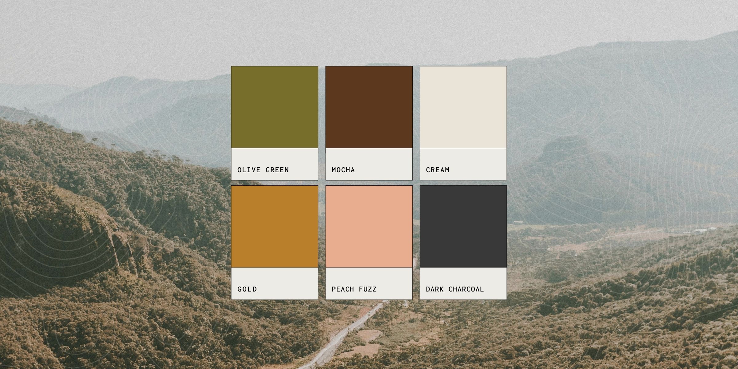
Here's a simple breakdown of connective color moods:
- Warm neutrals (sand, taupe, cream): grounding, natural, safe; these say you can exhale here
- Soft blues and aquas: calm, trustworthy, spacious; they lower the nervous system's guard
- Muted greens: balanced, restorative, connected to growth; they feel like being outside
- Peach and coral: friendly, creative, joyful; they invite people in without pressure
- Deep terracotta or rust: warm, earthy, soulful; they feel like something handmade and real
- Charcoal and slate: stable, thoughtful, refined; they communicate quiet confidence
It's not about choosing colors that look nice. It's about choosing ones that feel aligned with the energy you want to share and that resonate with the specific people you're trying to reach.
3. Balance creates harmony, and harmony creates trust.
Too many saturated tones can feel chaotic. Too many neutrals can feel flat or forgettable. The sweet spot lives in the interplay between calm and contrast, energy and ease.
When your brand color palette feels harmonious, it builds something deeper than aesthetic appeal: it builds emotional trust. Studies have found that trust-evoking colors positively predict both perceived quality and likelihood to recommend, meaning the way your palette feels doesn't just affect how people see your brand, it affects whether they tell others about it.
Think of your palette like a conversation. Some colors lead, carrying the energy, the personality, and the spark of the brand. Others listen, holding the space, creating breathing room and letting the expressive tones land. A brand that's all lead is exhausting. A brand that's all listen disappears. The magic is in knowing which colors to spotlight and which are supporting actors.
4. The colors you choose tell people if they belong.
Color psychology isn't just about mood. It's about belonging. When someone lands on your website or sees your content and thinks oh, this feels like me, that's your color palette doing its job. It's saying, before a single word: this was made for you.
Research has found that when colors feel misaligned with a brand's message, emotional connection drops. This tells us something important: it's not just about choosing beautiful colors. It's about choosing colors that feel true; true to your story, and true to the people you're trying to reach.
Studies show that around 81% of people recall a brand's color, while only 43% remember its name. Your palette may be the most memorable thing about you, which makes it one of the most powerful connection points you have.
That's color as connection in its most powerful form. Not choosing for everyone. Choosing so specifically and so intentionally for your people that they recognize themselves in your brand before they even understand why.
The takeaway: color is communication, and communication is connection.
Color isn't decoration. It's a first impression that happens in milliseconds, in the part of the brain that feels before it thinks.
When your color palette is chosen with intention, your visuals start to carry the same warmth as your voice and the same clarity as your values.
That's when your brand begins to humm. Softly, confidently, in tune with the people it's meant to reach.
If your color palette feels off, outdated, or like it's just not quite you anymore, let's look at it together. Color is one of the most powerful realignments we can make, and often one of the most meaningful.
Explore Humm House's brand design services or reach out to start a conversation about finding your brand's true color story.


.jpg)