
Seoulstice
brand identity design
soulful / organic / deep
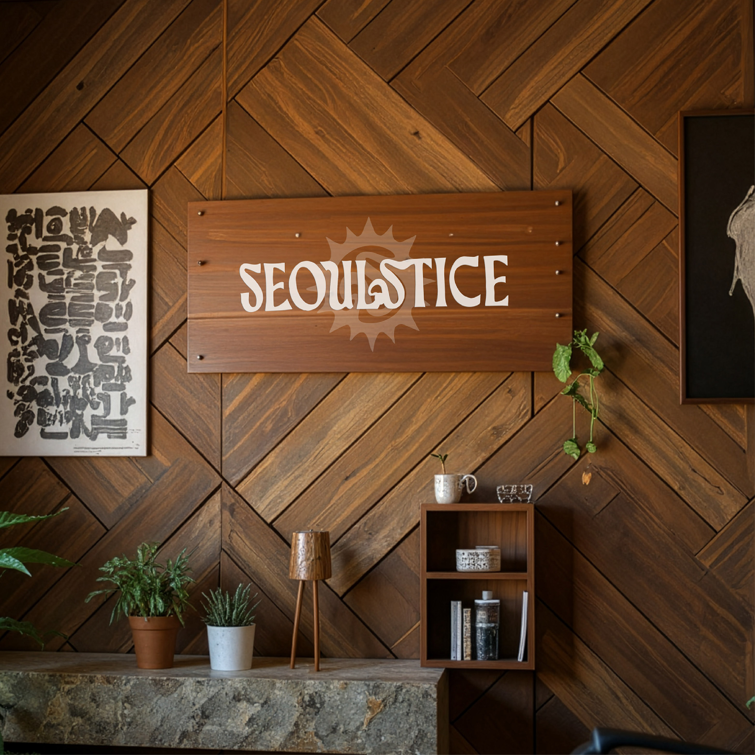
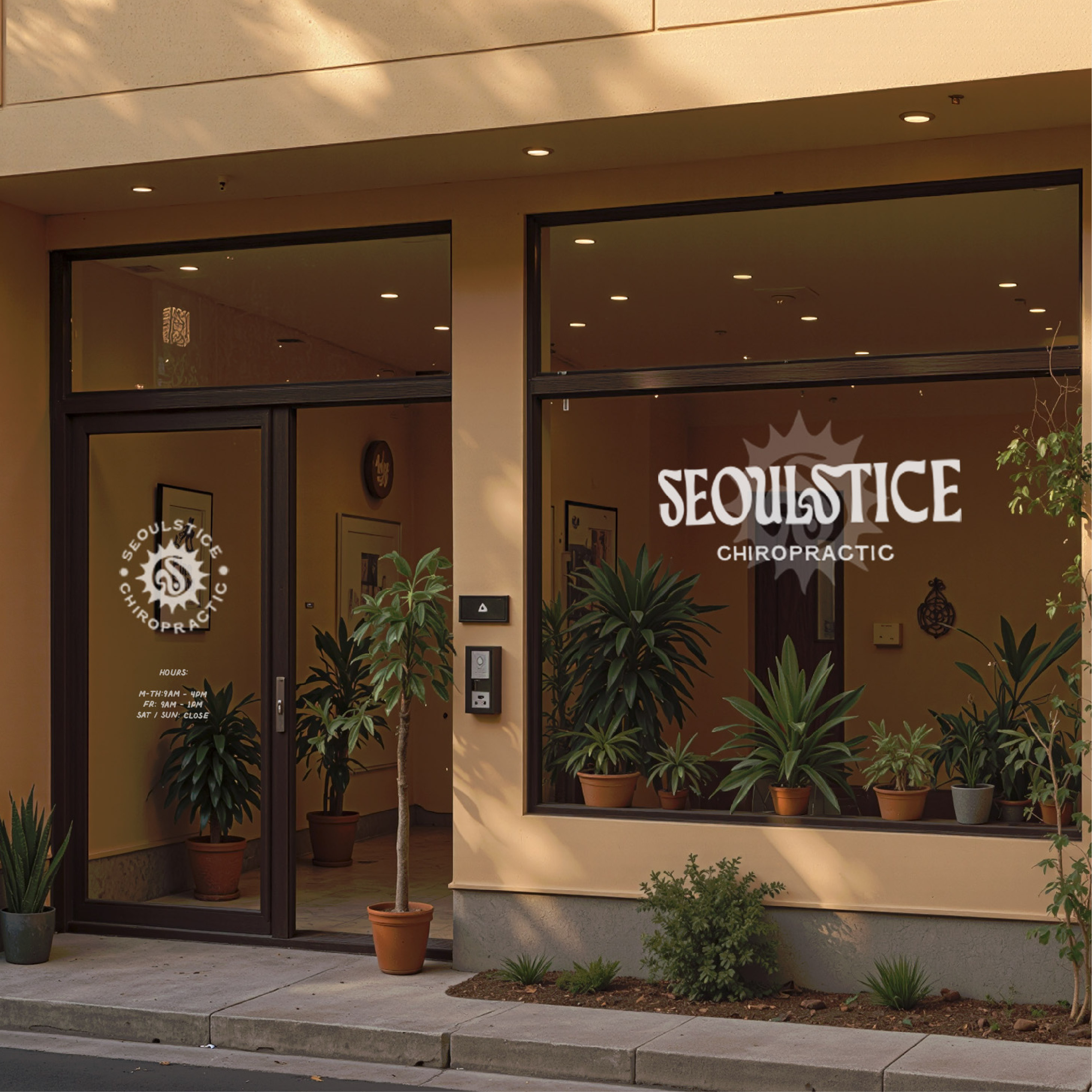
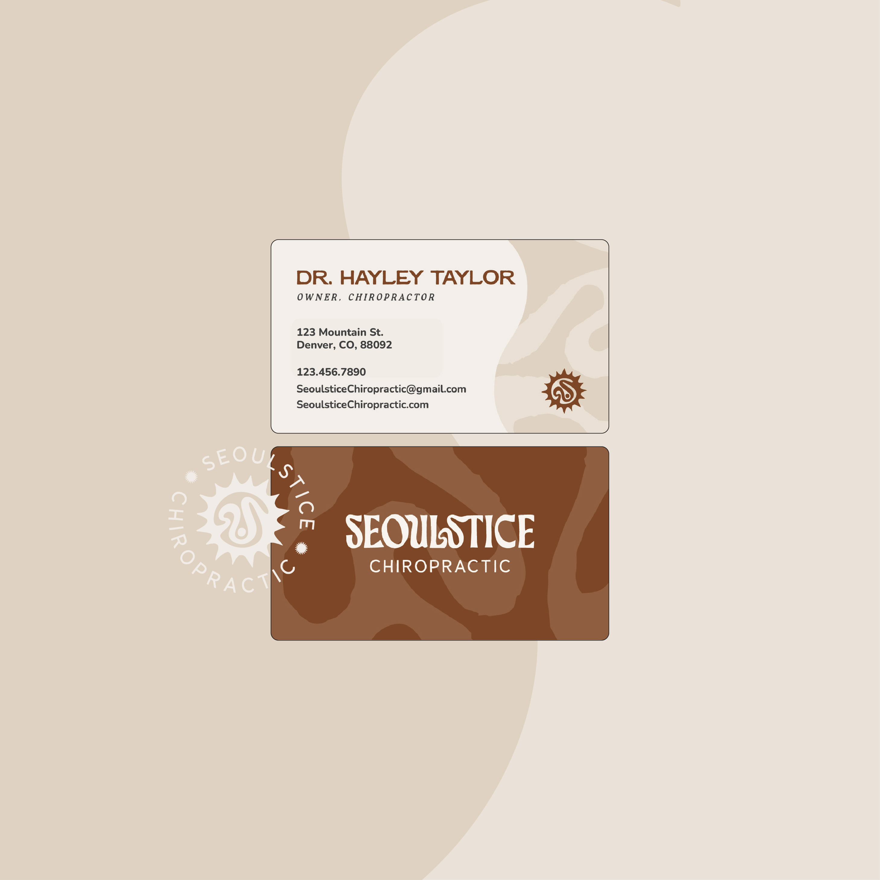
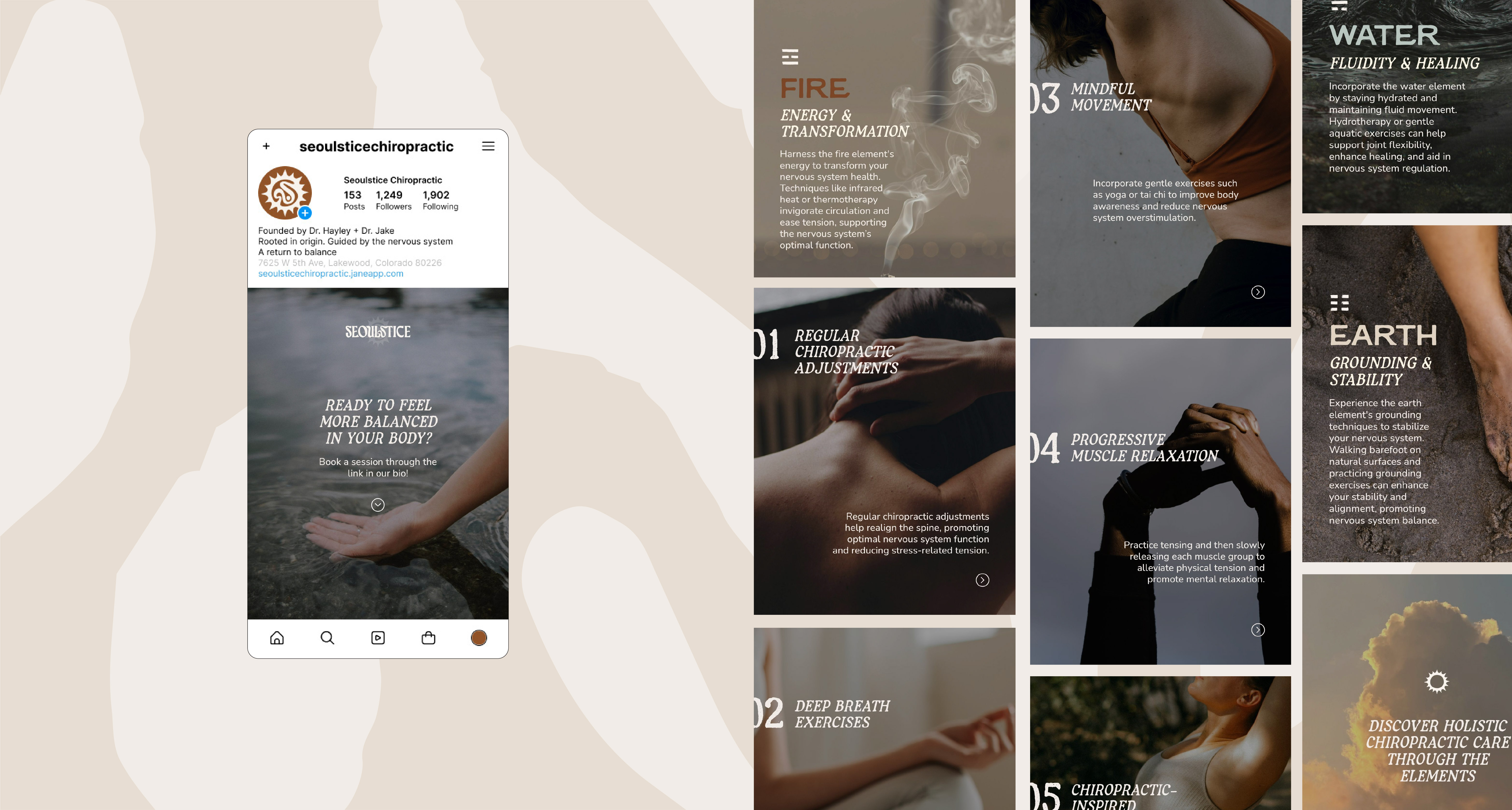
These two chiropractors are entering a new chapter and merging into a shared practice rooted in nervous-system-based, whole-body healing. The goal was to create a brand identity that felt grounded, calming and versatile enough to live on signage, booking platforms, merchandise and future growth.
Through the design, we wanted to embrace:
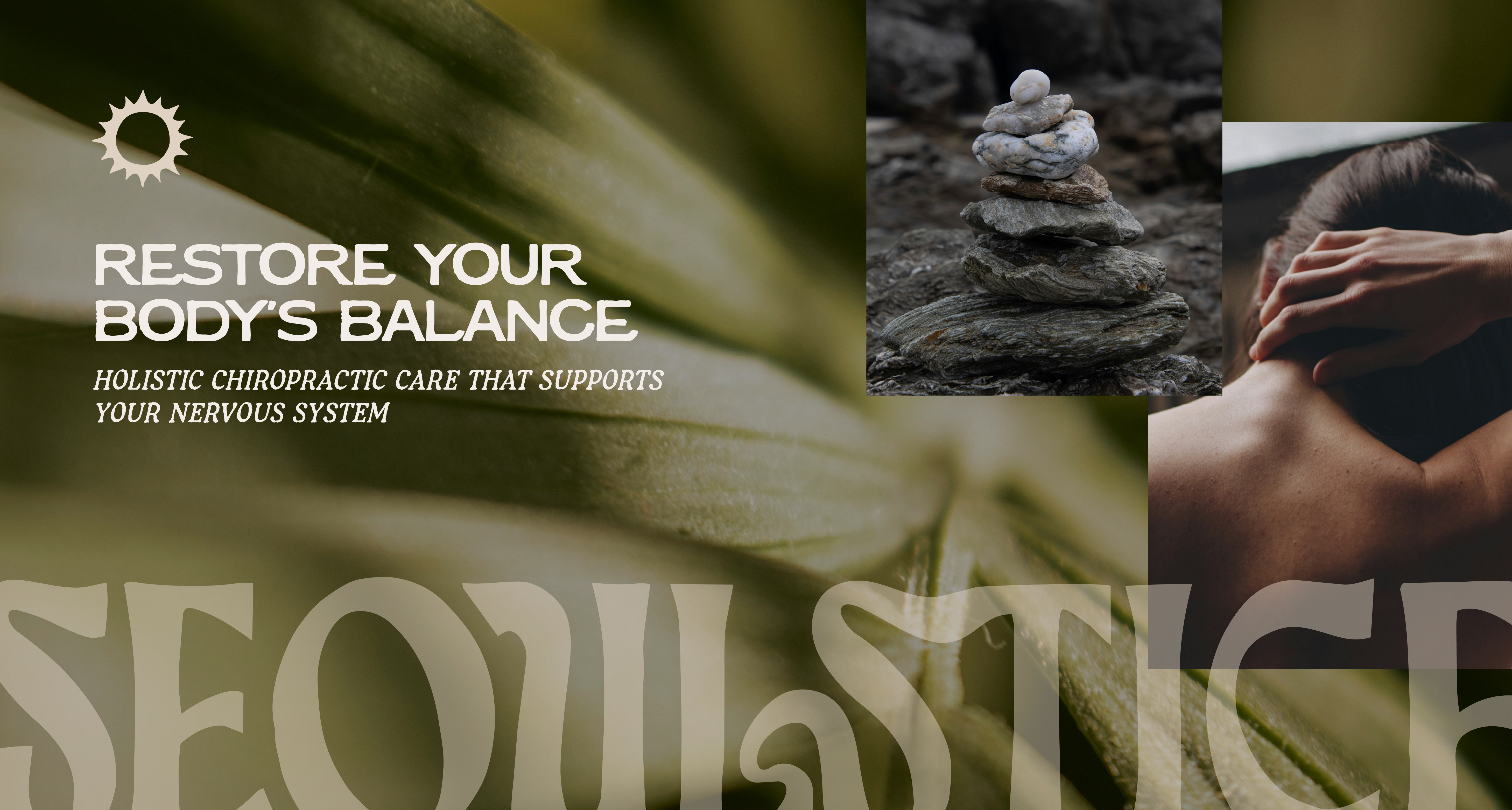
✶ The symbolism of the solstice (transition, balance, sun, renewal)
✶ An element of yin yang, light & dark balance
✶ A subtle nod to Seoul, honoring Hayley’s Korean roots
✶ A holistic, nervous-system-focused philosophy
✶ A warm, earthy yet professional aesthetic
The logomark itself is made up of a sun shape combined with the "S" letterform and inspired by movement and the balance of a yin yang symbol.
.svg)


[Nina] didn’t just bring our vision to life—she elevated it, going beyond what we thought was possible and creating something that truly captured the essence of what we were trying to communicate.
-
Dr. Hayley Taylor
.svg)